As a florist, sometimes I'm given a wedding Pinterest board that might have images from hundreds of different weddings in different cities, colors, and styles. And one of the coolest parts of my job is taking those hundreds of images and distilling them into designs I know my clients will love. How do I do it? The short answer is by knowing floral design principles. In order to make sense of that Pinterest board, I have to be able to decode which principles of floral design are being used in those images, and how they are being applied.
To help you find common threads among your inspiration images, I wanted to take a little art school detour this week! We'll talk about the main principles of floral design, which will help you later on when you're articulating your vision to a florist.

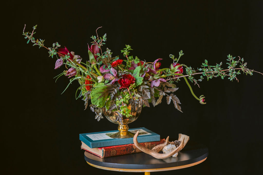
A great example of using line in an arrangement. Photo by Suzanne Rothmeyer.
Here are the 12 key floral design principles, summarized:
- Line: Different types of lines can give structure and direction, create a sense of movement, and pique our interest.
- Scale: Designers often use size and relationships between objects' size to create drama and direct the viewer to focus on certain elements.
- Color: Color is the easiest way to create a mood, vibe, or convey an emotion through design.
- Negative Space: Designers frequently think about the space between elements (cue Dave Matthews), and making designs "pop" by playing with negative space.
- Transparency: Transparency is just the extent to which your design is see-through, and it can create lots of dimension and interest.
- Symmetry/Asymmetry: Designers can put something identical on either side of an arrangement for a classic look, or use asymmetry for a more modern look.
- Texture: Texture adds depth and substance to designs, and is wonderful for avoiding a look that is too "flat!"
- Direction: How does your eye move across a design? Designers often use lines to direct your eye to a focal point.
- Movement: Flowers can literally move in the breeze, or be placed so they look like they are in motion.
- Depth: How far back does the design go? We use layers, overlapping elements, textures, and transparency to create depth and interest.
- Repetition/Randomness: Repeating floral elements creates cohesion, but must be balanced with strategic randomness to keep designs organic.
- Contrast: Designers can highlight certain elements based on differences like size, color, thickness, and height.
I've also developed an illustrated guide to these floral design principles, which has examples of each principle and commentary on how it was incorporated into each floral design. You can get the full, free PDF that is too big to put here! It's a huge help when trying to decode inspiration images to figure out which design elements are most important to your wedding flowers. Just enter your info below, so we know where to send it.
Next week, we will talk about flower colors, and I will share a link to a great resource on figuring out what flowers are appropriate for your wedding color palette. If there are other questions you would like to see answered, please leave a comment below! And whenever you are ready to talk about your wedding, you can read about our approach to weddings and book a consultation here!