Part of developing your wedding vision is to think about your wedding colors, especially for flowers. If you didn't check out last week's blog post, go ahead and take a peek! Last week, we talked about color helping us in various ways. Color can create a mood, signify emotions, or provide context due to our associations with certain colors. In the past, "wedding colors" has traditionally meant just 2 colors that a couple uses in their entire wedding. (Think "navy and blush" flowers, stationary, flowers, garments, decor...you get the picture.) Limiting yourself to two wedding colors can backfire by evoking the sense of being at a high school prom. Definitely NOT what you are going for! So in modern floral design, we most often talk about wedding color palettes.

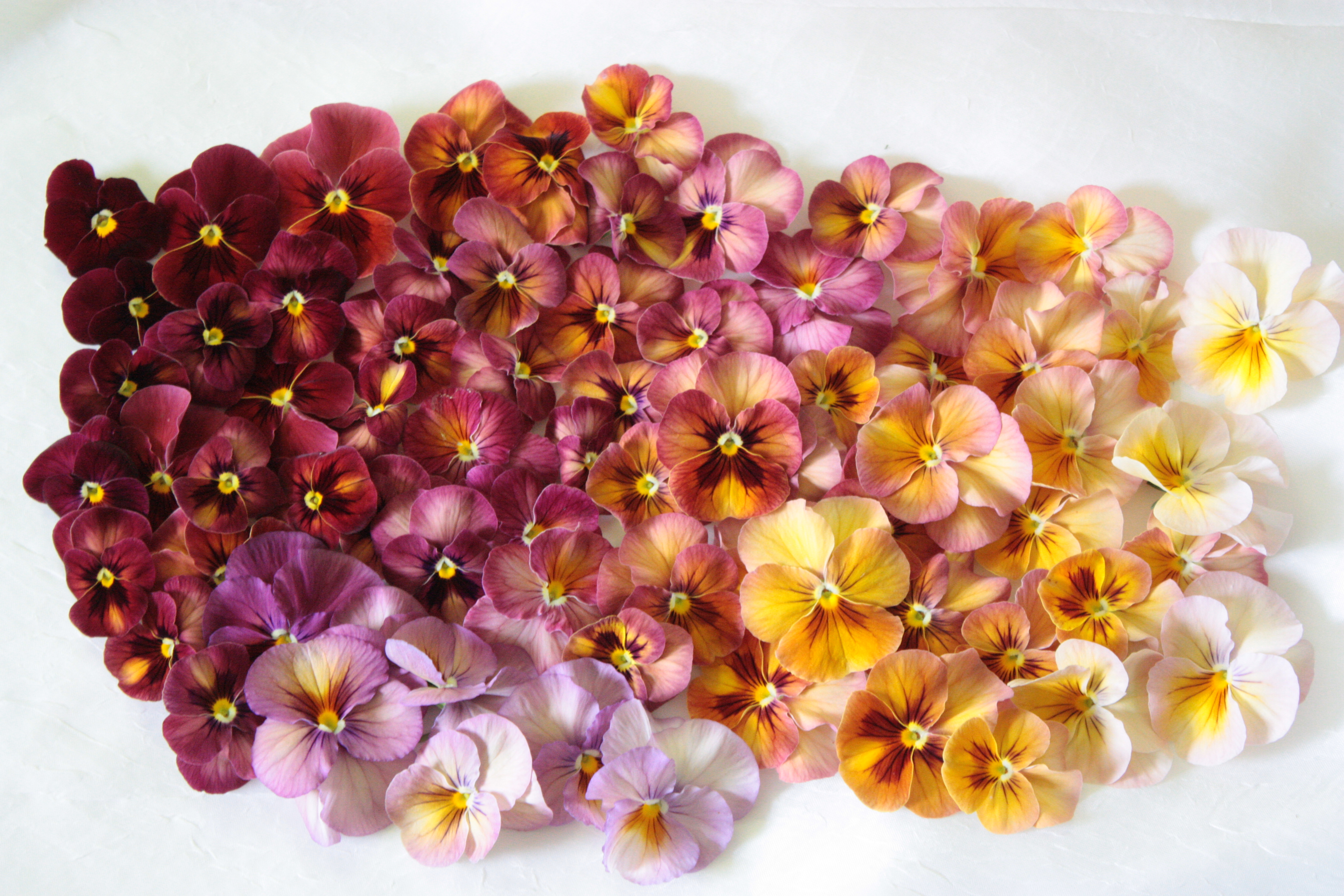
A color study of pansies illustrating color gradients and complexities in palette within the same species.
When you think about your wedding floral palette, there are lots of directions you could go in. I would encourage you to think about the season of your wedding, your venue, and the colors associated with it. For summer wedding colors, I think of bright jewel tones, lots of greenery, and a varied palette. Summer is when everything is growing at once, so the palette could cover the whole color wheel! For a spring wedding, I think about more pastel tones, softer colors, and more yellows. And fall weddings are full of all of the warm, rich, earthy tones we associate with the season. Winter wedding colors vary wildly, since local Seattle flowers are generally unavailable in the winter months. In these months, winter white is always chic. I'm also loving the dark and moody palettes we have been seeing in recent years. They pair and photograph really well with our winter rain and short day lengths!
Whatever the season or palette of your wedding, I'd love to share this week's free PDF with you: the Flower Color Primer. It's a hefty tool to put in your personal toolkit, and contains hundreds of flowers sorted by color. The Flower Color Primer will definitely help you identify flowers from your inspiration photos. In addition, I am also hopeful it will introduce you to some new local flowers that would fit within your wedding palette! I've also made sure to include those tricky, "in-between" colors like peach and blush. The PDF is gigantic since it has so many images, and it's way too big to share here! So instead of breaking our website, just enter your info below, so we know where to send this fantastic tool! 🙂
If you enjoy this week's PDF, I'd also encourage you to check out the book Flower Color Guide, by Darroch & Michael Putnam. It's 484 pages of straight up flower color studies!
Next week, we will talk about all the latest and greatest trends in wedding floral design. If there are other questions you would like to see answered, please leave a comment below! And whenever you are ready to talk about your wedding, you can read about our approach to weddings and book a consultation here! Thanks for reading!